Figure 1
(Zhen Jiang and Robert Gentleman, Bioinformatics, 2007)
(GSEA) is a computational method that determines whether an a priori defined set of genes shows statistically significant, concordant differences between two biological states (e.g. phenotypes). Ref: (http://www.broad.mit.edu/gsea/)
Traditional statistics use adjusted P-values with some arbitrary cutoff, treating genes with slightly different P-values as different entities. Also, small differences in mRNA abundance are often not detected, nor are large changes in just a few genes.
GSEA remedies this by using all the genes in your expression data for the analysis. GSEA also compiles per-gene statistics across genes within a gene set, allowing for the detection of small changes in many genes or large changes in few genes.
GSEA algorithm implemented in MeV v4.3 is based on Zhen Jiang and Robert Gentleman's 2007 paper
GSEA algorithm can be roughly divided in to three steps:
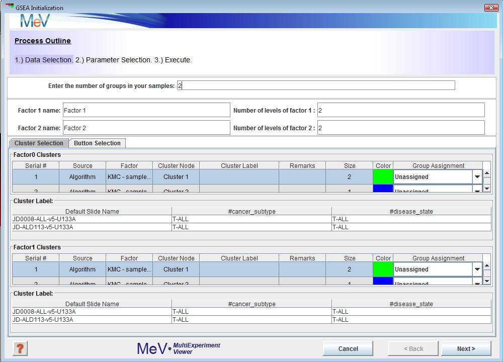
GSEA uses a set of parameter input dialogs that open sequentially to provide input options that correspond to each step of the process. The first step in the processes is data selection which lets you assign phenotype/class labels to your samples.

The default assignment (Figure 1)is two groups (factors) with two levels per group. This can be changed to reflect the groups present in your data.
For example, if cancer subtype is the phenotype (factors) that influences your data the most, enter 1 in thetextbox.
B-ALL and T-ALL are the two levels of this phenotype, so enter 2 in the textbox. If you have pre selected sample clusters and decide to use the tab just assign group numbers using the Group Assignment drop down as shown in Figure 2.
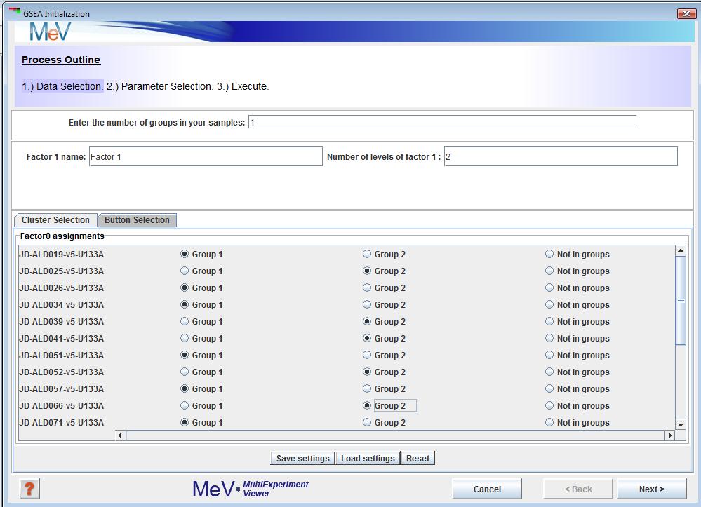
You can also use the tab shown in Figure 3 to achieve the same. Group1 and Group2 symbolize B-ALL and T-ALL. You can save these grouping using the button. To load saved groupings, use the button. Reset button will clear all your choices. Once you are done, click the button.
This brings you to the “Parameter Selection” section shown in Figure 4. The GUI is pretty self explanatory, but here is some better clarification about the available methods for collapsing probes to genes, loading gene sets and loading annotations.
The button corresponding to lets you choose the directory containing gene set files. You can select the files you want to use from the panel. panel indicates the gene set files that you chose to use for this analysis. In addition to this gene sets can also be downloaded from the MIT/Broad website.
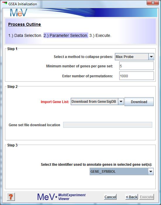
If your gene set file is *.gmt or *.gmx format, drop down is automatically populated with “GENE_SYMBOL” as shown in figure above. In case of a custom gene set file, you must manually choose the gene identifier from the drop down.
The panel lets you upload annotations. Annotations are a MUST for running GSEA. Details on how to load annotations is described in Using the Annotation Feature.
The last step is to hit the Execute button. GSEA outputs besides the standard MeV viewers three new viewers namely and . under lists gene sets sorted by their Over enriched (upper p values). Upper p values are the probability of seeing a test statistic higher than the observed one.
Right clicking on the rows in the table as shown in Figure 5 lets you navigate to different viewers. table contains gene sets which do not meet the minimum genes per gene set criteria and hence not included in analysis. “Probe to Gene Mapping” table shows all the probes which map to a gene.
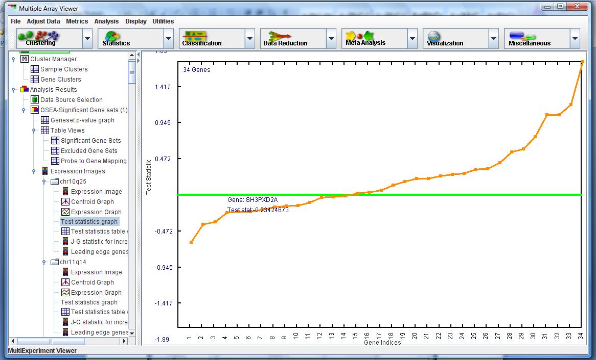
shown in Figure 6 aims to show how genes within a gene set contribute to the overall gene-set-level metric. This metric is computed by summing the distance from the green line to the orange point and then normalizing this sum by the square root of the number of genes in the gene set.
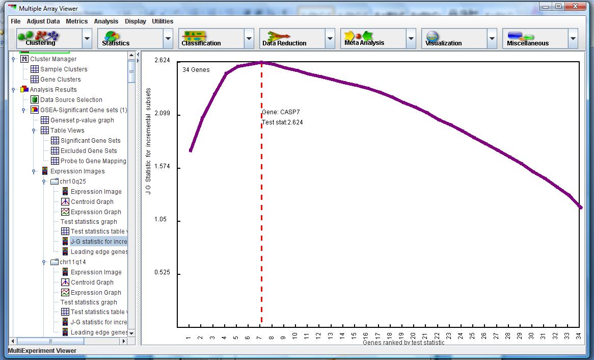
in Figure 7 shows which subset of genes within the gene set is contributing to the significance of the gene set level metric. The leading edge subset is calculated by first ranking the genes based on largest to smallest test statistics. We then calculate the Jiang-Gentleman statistic for subsets of the gene set, starting with the first subset containing the gene with the largest t-statistic, and then incrementing the subset to include the next gene with the next largest t-statistic. We iterate through until the final subset contains all the genes in the gene set. The subset which maximizes the Jiang-Gentleman statistic suggests that this group of genes contribute the most to the gene-set level metric