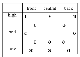
The actual physical distribution of tongue body positions is close to
being an ellipse:
For some reason, printers don't like charts that look like ellipses. The
IPA vowel chart makes the ellipse look closer to being a rectangle, but
still preserves much of the relative spacing of the vowels:

(We'll look more at the IPA vowel chart later in the course.)
A very idealized (and ruthlessly rectangular) vowel chart is usually used in
the North American tradition: