
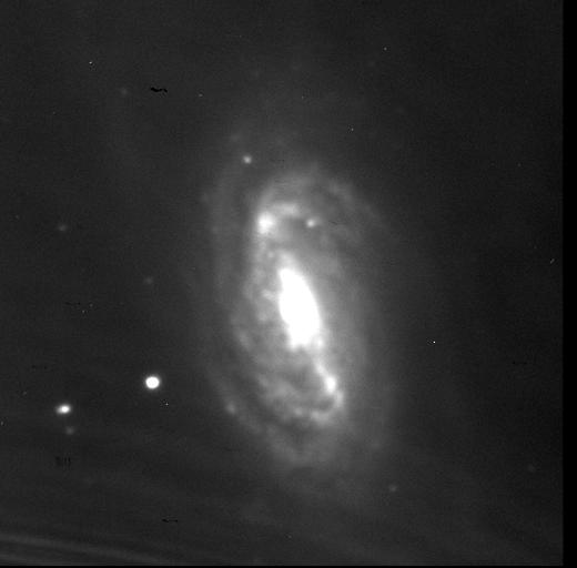
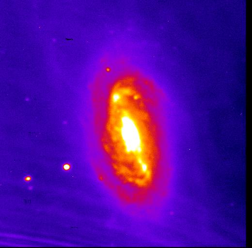
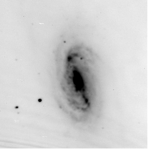
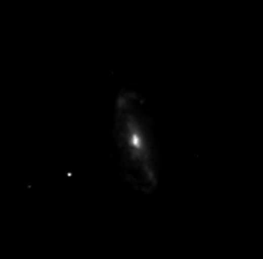
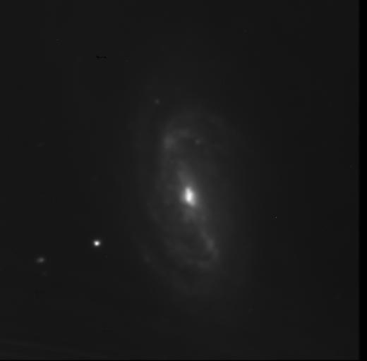
All images of NGC 2903 here are presented north up and east left, the calibration masters are presented with north down due to ImageJ's penchant for flipping fits files. This is a very long page, so I've placed anchors after every section. Click here to go straight to blue. I've also created some colour composite images.
Click on the thumbnails to see full size versions of the calibration masters. Image has linear scaling 285.11/2591.03.
Master Bias
Master Dark
Master Flat
|
Processing: |
Scaling: 357.94/832.11 |
 |
|
 |
 |
|
Scaling: 564.93/2551.5 |
 |
|
 |
 |
|
Linear Scaling: 6.60/7.86 |
 |
|
 |
 |
|
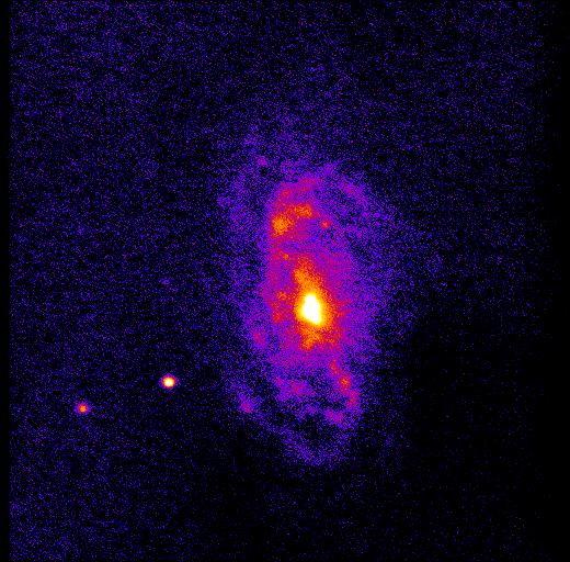
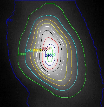
Made using the Contour Plotter Plugin (by Walter O'Dell, available here) |
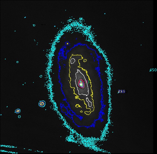 |
2500 - green |
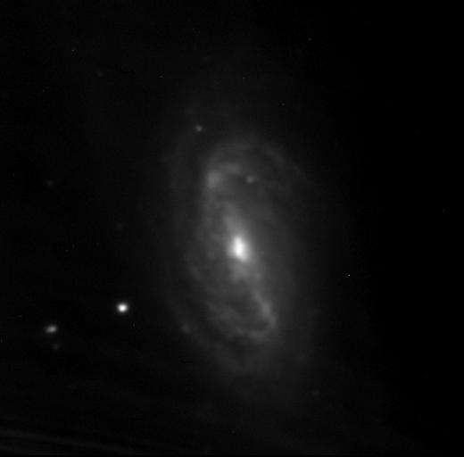
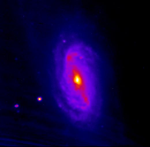
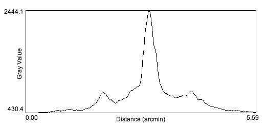
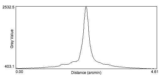
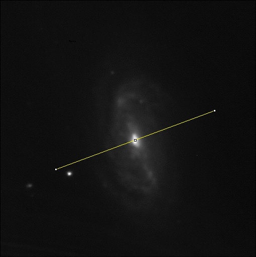
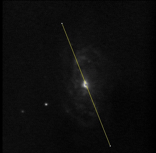
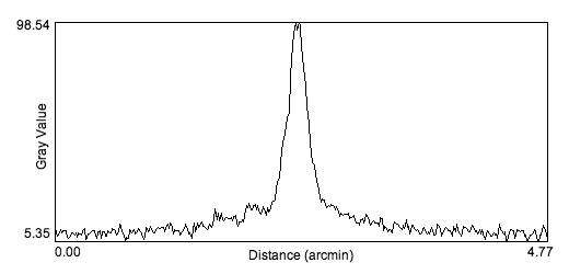
Major axis profile is from north to south, the minor axis profile is from east to west (left to right). There is much more revealed on the major axis profile than the minor axis profile. The top peak in both is obviously the central nuclear region. The two smaller peaks to either side of the central peak in the major axis plot appear to be the "knobs" on the "ends" of the central bar, where they seem to fork into two thinner spiral arms (the two white lobes in the contour map). |
 |
 |
 |
 |
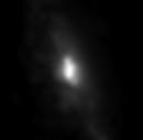
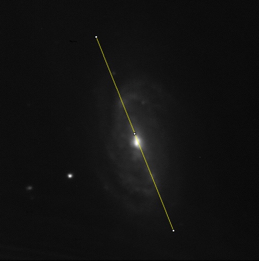
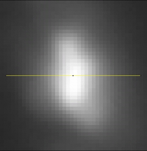
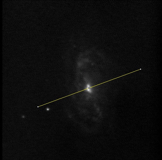
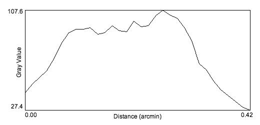
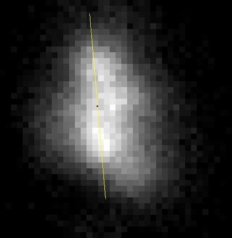
| These are three plots of the nuclear region. The FOV of the nucleus images is 33"x33.6" as before. The first plot is a cross-section of the along the x-axis of the nucleus. The line is drawn north to south. It doesn't seem to tell a lot about the nucleus region, other than it seems to resemble a gaussian distribution. | 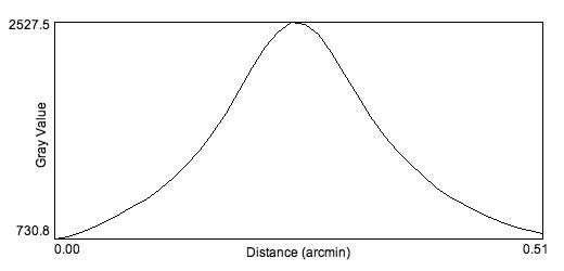 |
 |
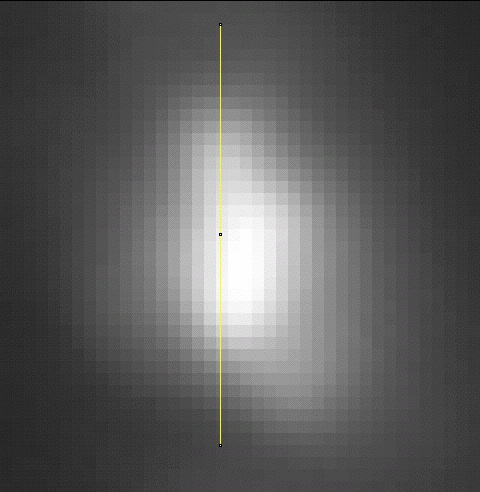
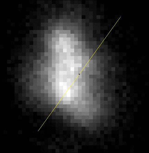
| Line drawn East to West. The second plot is along the y-axis of the nucleus, and displays a bit more information. It shows a bulge on the north side, where one of the hot spots is, but not much else. | 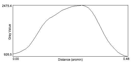 |
 |
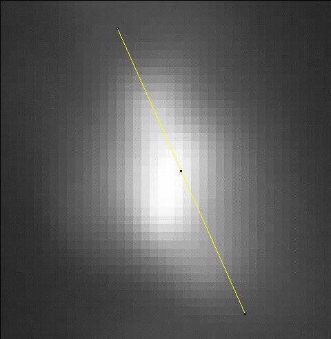
| The line is drawn NE to SW. This plot is across the most "patchiness" in an attempt to see whether the hot spots will show as peaks in the plot. Unfortunately, there are no peaks other than the central one, but there are more bulges to the south than there were in the straight y-axis plot, showing the slight variation in the regions. This is not a really effective way of trying to detect the hot spots. | 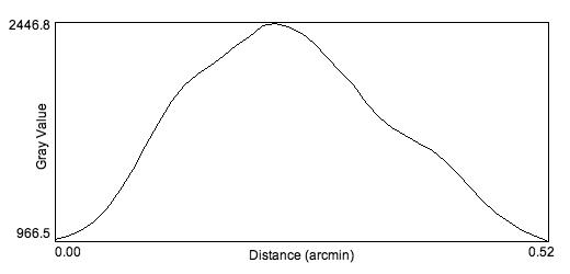 |
 |
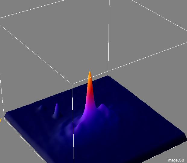
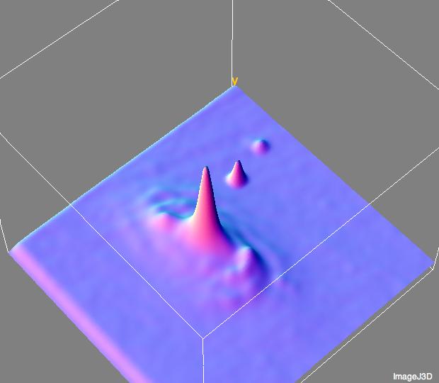
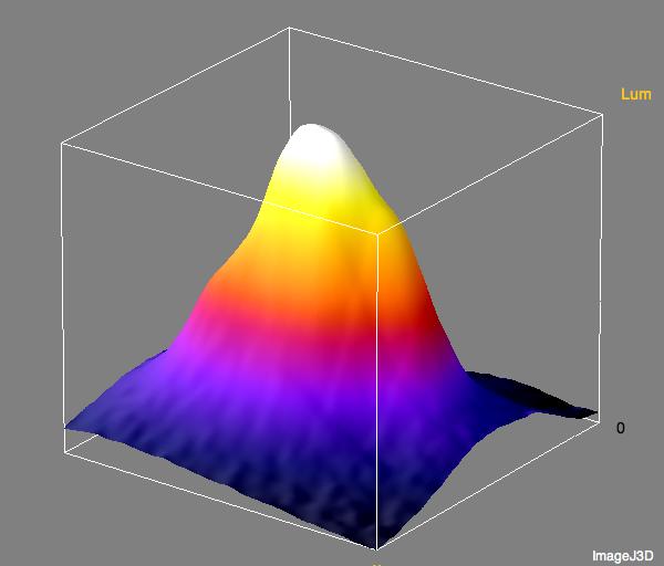
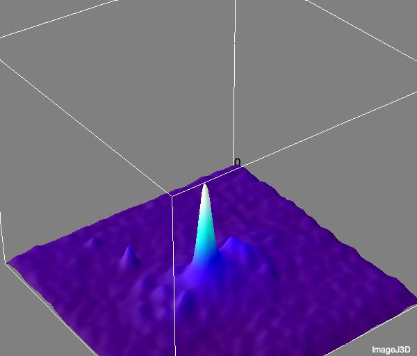
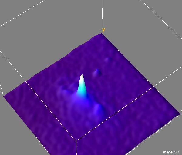
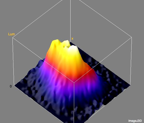
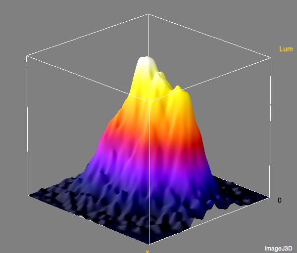
| These were made using the Interactive 3D Surface Plot plugin (by Kai Uwe Barthel, available here). The first two plots are coloured using the fire LUT, and the one at the bottom right is coloured using the gradient LUT. The 0 at the images is the northeast corner of the image, the two small peaks off the galaxy are the two stars. The fire plots show off a lot of the detail of the east side of the galaxy, and the gradient plot better displays the variations of the west side. A lot more detail of the faint spiral arms is visible in the gradient plot. | 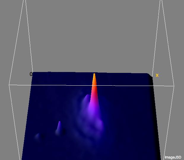 |
 |
 |
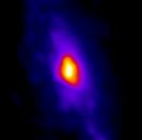
| These plots are of the nucleus region: | |
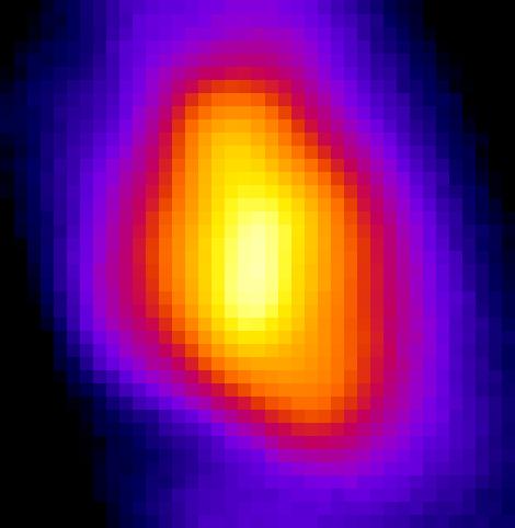
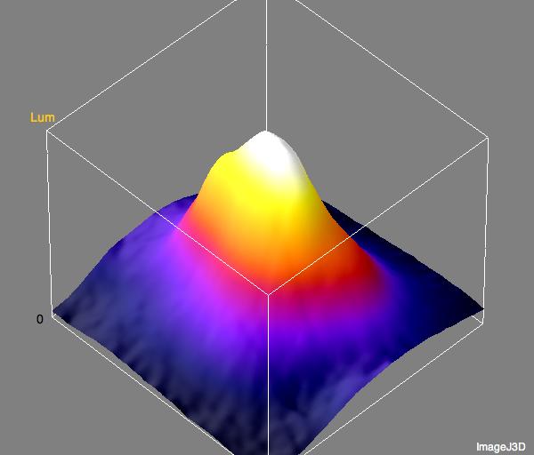
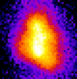
| Once again, the plots are coloured using the fire LUT and the zero marks the northeast corner for the image. These plots are a lot more effective than just the cross sections at showing off the variations in brightness of the region. The base image had a linear scaling of 644/2544.0. Here there appears to be a large central bulge surrounded by two smaller bulges. Unfortunately, the overall shape is still a bulge, the hot spots aren't defined. | |
 |
 |
Click on the thumbnails to see full size versions of the calibration masters.
Master Bias
Master Dark
Master Flat
|
Processing: |
Scaling: 10.41/21.40 |
 |
|
 |
 |
|
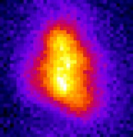
| Scaling:14.62/108.88 Once again, the structure of the hot spot area in the nucleus is more visible. And unlike the clear image, which just appears to be an amorphous blob, there actually seems to be some definition between the regions dispite the noisiness of the image. I can actually see three discrete regions in the zoomed in portion of the nucleus. The FOV of the zoomed image is ~33"x36". |
 |
|
 |
 |
|
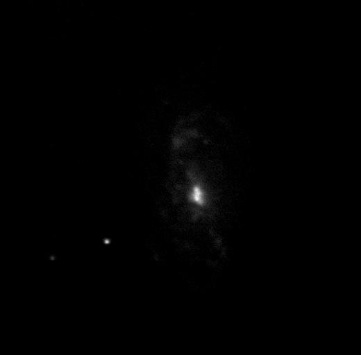
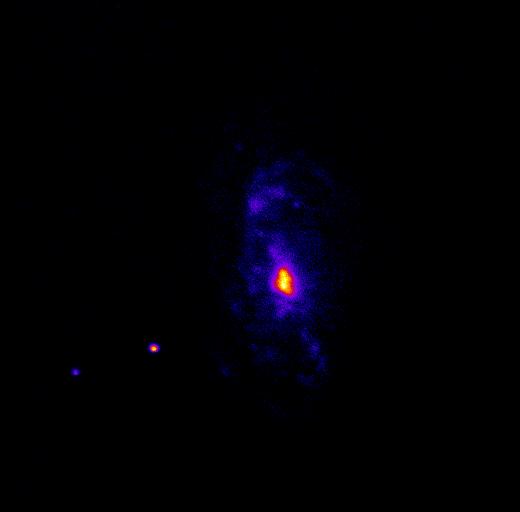
| Linear scaling: 2.32/4.13 This image shows as much (or more) detail of the fainter regions while reducing the effect of the noise (as can be seen from both the greyscale and false colour images), though the nucleus is broadened and less defined as before with the clear filter image. The FOV of the nucleus image is 33"x33.6" and it's scaled to 3.01/4.68. |
 |
|
 |
 |
|
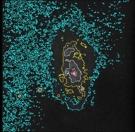
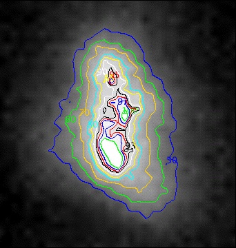
Due to the image being so noisy, I applied an averaging filter with a 2 pixel radius to the image before mapping the contours. This simply takes all the pixels within that 2 pixel radius and averages them. Without the filter, the contours surround a mess of individual pixels instead of making neat regions. |
 |
100 - green |
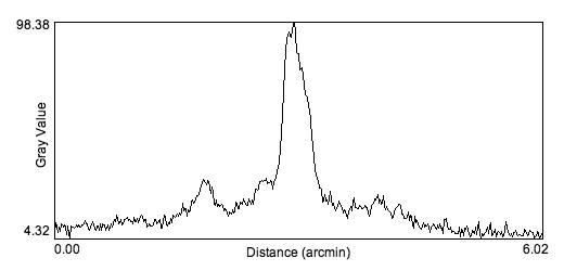
| Once again, these are plots along the major and minor axes of the galaxy. The central peak of both plots seems to have some variation at the top instead of being smooth all the way across, though whether it is caused simply by noise, or by the hot spots has yet to be seen. Once again, the two "knobs" at the end are visible as peaks in the plot, though the one to the south seems dimmer than the northern one. This could mean the southern arm is dimmer in blue than the northern. However, previous images show that the area where the southern knob is has less noise, so it may be because of that Once again, the plot across the minor axis does not show as much variation as the northern plot, though there are two mini-peaks to the left of the central peak that may represent the line crossing a pair of spiral arms as before. |
 |
 |
 |
 |
| In this section, since the variations in colour were more obvious than in the clear, the lines were drawn so as to intersect as much of the variation as possible. The first line was drawn north to south. In this section, four peaks can be seen, though I suspect the two small central peaks may be due to noise. But there is definitely more definition than in the clear image. |
 |
 |
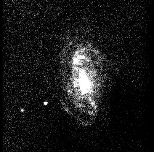
| The line here was drawn southeast to northwest. While there is only one peak, there is a prominent bulge to the northeast, which is the location of one of the hot spots as defined by the lo-res studies (see blurred SDSS image on my modern knowledge page). | 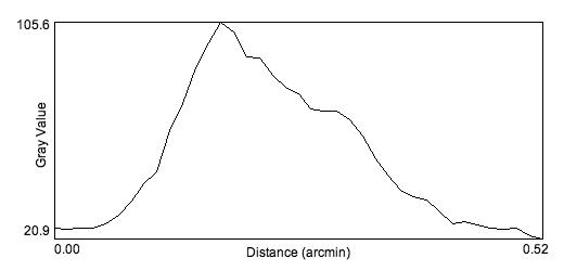 |
 |
| In this image, there are two peaks and a prominent bulge. The two peaks occur where there are hot spots in the lo-res study, the bulge where there is a fainter region. | 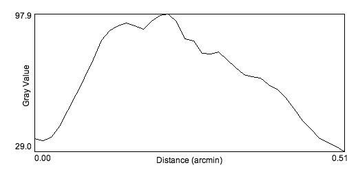 |
 |
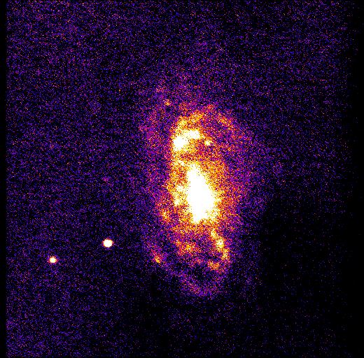
| These images are coloured using the thermal LUT, as it showed the fainter regions of the galaxy against the bumpiness of the background better, but it is still very faint. As the major axis profile suggests, the southern "knot" at the end of the central bar is dimmer than the northern one. Once again the west side of the galaxy has less visible detail than the east side. | 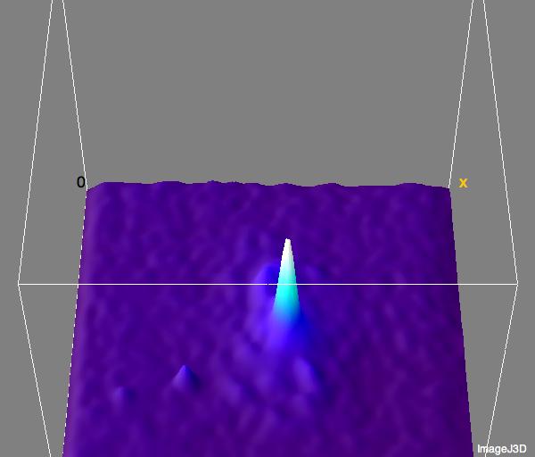 |
 |
 |
| Nucleus plots: | |
| These images have been coloured using the fire LUT. There is a lot more definition than in the clear image, with many of the observed peaks corresponding to observed hot spots in the lo-res image (more on this in the Discussion section) despite the noisiness of the image. The base image was scaled 25.05/108.55. | |
 |
 |
Here are some colour composite images I put together using our images and i and u filter data from the Sloan Digital Sky Survey. I actually had to piece the Sloan data together from two plates as the galaxy was on the edge.
 |
 |
These are overlays of all four images with two slightly different colour schemes. In the left image, my blue data is coloured cyan, my clear data is coloured magenta, the u data is coloured blue and the i data is coloured yellow. In the right image the blue data is coloured magenta, the clear data is coloured yellow, the u data is coloured cyan, and the i data is orange. Slightly more detail is seen on the righthand image.
• Raw • Log • Basic Image •
• Back • Index •
_________________________________________
Banner image is a slice of HST image by NASA/ESA
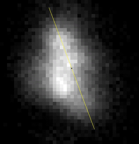
 33"x33.6"
 33"x33.6"